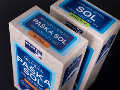
PZ Varaždinsko povrće (Varaždin vegetable) is a group of domestic farmers that produces excellent – potato. We assisted in devising and packaging design for various types of potato.
Good packaging design does not cheat the customer but transrefs a story of quality
Graphic that will present a product is one of the most important elements of market success. Just like developed and high quality company visual identityor brand promotes a positive perception, equally when deciding on purchases, we first consider the advantages that bring us the use of that product. As the visualization is always the imperative of our perception, it must at once decrypt our need and her satisfaction.
In the example of potato packaging design that we created for the domestic producer of PZ Varazdinsko povrće, it is clear that the primary uninteresting product can and must get a quality visualsupgrade to communicate effectively and clearly with the market. Customer's need is defined by his desire to create a quality daily dish menu for himself and his family. We offer a solution at first, visual, contact with the product - ready meals as an idea. Of course, like in this case, feedback from the market about increasing demand for products with new visual identity is always a pleasant cognition.


