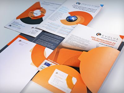
As part of developing Farmex company visual identity, we created business folder design and related business card design.
Elegant and colorful folder design
Farmex company as distributor of cosmetic and pharmaceutical products in its business philosophy primarily cares for human health and beauty. As these two concepts are dictated by the balance of our inner condition and environment, we set up Farmex corporate identity upgrade as a story about the balance of opposed graphic elements. Contrast of bright and dark colors, reflection of elements and "unpredictable" structure of circular forms versus strictly regular bands give the required dynamics. Stylized wood, as a symbol of nature and life processes, in this case is the dominant element of the health and beauty story.


