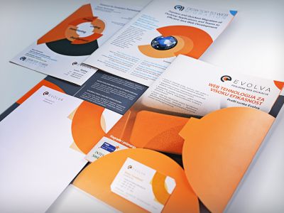
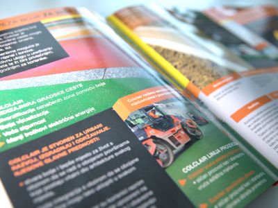
Financial reports and documentation are often very tiring. However, it is also possible for such materials to develop an element of interest through a brochure design.
Often we encounter boring unattractive formal documents whose content does not reflect any communication parameters visually, and with poor application of formatting standards, the content also loses the readability and efficiency of data transfer. When designing FIMA company financial brochures, elements of corporate identity were incorporated into the originally design framework. Clearly defined structure and use of the dynamic color schemes provide an efficient insight into the presented content. At the same time, style simplicity and precision leave the impression of professional relationship and value of service.


